As Union St Printmakers, Simone Tippett regularly curates and co-curates exhibitions, folios
and community print events… This is the latest…
Detail of Damien Warman’s gorgeous 3 plate copper etching,
‘Frangipanis cover the path, the summer after my brother was born’.
Weird Adelaide / A Tribute to Barbara Hanrahan
@ Burra Regional Art Gallery
Fringe Festival 2022
Weird Adelaide / A Tribute to Barbara Hanrahan
@ Mrs Harris’ Shop
Sat 8 to Sun 30 May 2021
The brainchild of Adelaide writer Tracy Crisp, this gorgeous exhibition celebrates all we love about Barbara Hanrahan’s writings and prints, as well as the weird wonky wonderfulness of Adelaide and SA places.
“What we want now in Adelaide are writers and artists who work from the heart of those commonplace suburban streets, who recognise the weirdness of the ordinary, who record it before the version of it we have now is swept away. We want passion and intensity, an art that comes from places like Port Adelaide and Thebarton and Holden Hill; that stays unofficially weird.”
Barbara Hanrahan
Artists - Bridgitte Williams, Caren Florance, Damien Warman, Georgina Willoughby, Izabella Shaw, Jake Holmes, Joshua Searson, Lloma Mackenzie, Lorelei Medcalf, Lucy Timbrell, Sally Heinrich, Simone Tippett, Sue Garrard, Tracy Crisp, Vicki Reynolds. (In alphabetical order by first name. Click names for websites/Instagram links.)

Our stories of hardship and discovery overlay the South Australian landscape. Local legends become history as they are repeated over time, blending fact and fiction and growing to encompass truths about both events and ourselves. Dead Man's Pass continues to be used daily by many, who cross over the river and through the landscape, blending their stories with that of an unknown traveller.
Screenprint and linocut on Somerset paper
$240 (5 A/Ps for sale)
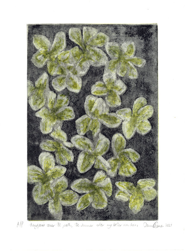
"Frangipanis cover the ground, the summer after my brother was born" grew from reflections on my preschool memories, in particular of the "Frangipani Gardens" at the Port Noarlunga Hotel, home of cockatoos, kangaroos, and other mysterious two-legged fauna.
The work is a soft-ground etching on aquatint. The interplay in production between the organic (rosin, tallow, linseed oil, burnt bone, turpentine, frangipani flowers collected and wrapped in muslin before being crushed against the plate, cotton paper, wool blankets) and inorganic (pumice, whiting, copper, iron salts as both mordant and pigment) and that in-between material ashphaltum, make of the process itself for me a memento mori.
Mult-plate copper etching with spit bite & aquatint on Somerset paper
$300 (6 A/Ps for sale)
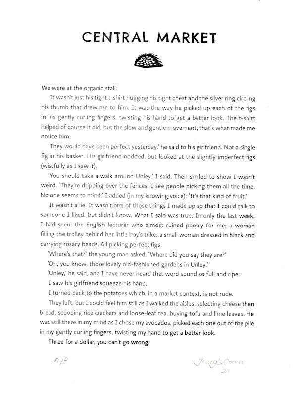
Tracy Crisp... When I read Barbara Hanrahan's 'Weird Adelaide' (which led me to The Scent of Eucalyptus which led me to everything else) it had an enormous impact on my conception of myself as a writer. I understood myself as an Adelaide writer. Someone whose writing was grounded in her relationship with this city.
I write in many different formats, but what I love the most is to write small pieces that can be read on their own, but understood as fragments of larger stories. It's the style I was able to experiment with most freely in my blogging days in the early 2000's. Caren was one of my first blogging friends. I was fascinated by her world of letterpress and printmaking and inspired by her commitment to experimenting, to collaborating and to sharing her skills and knowledge. When I was looking for a way to share my love of Barbara Hanrahan's writing but didn't know where to start, turning to Caren was the natural solution.
Caren Florance... Barbara Hanrahan’s imagery is very distinctive, and part of this is because she lets her ideas work together with the visual language of whichever print medium she uses: she makes the most of the scratch of an etching tool, or the difference between the short, careful cuts into a woodblock and the bold buttery cutting of a warm lino plate. Her later linocuts are some of my favourite prints, so I turned to them when asked to design Tracy’s words into pages for the folio. I picked out some of her classic motifs as embellishments, and chose a title typeface that looked hand-drawn, or even hand-cut (Chelsea Market Pro). The idea was to look bold, legible and quirky without being cute, which is, I think, a word I would never apply to Hanrahan’s individual vision of the world. She was individual, determined, slantwise, and irreplaceable. Just like Tracy.
Photopolymer letterpress print on Somerset bookwove paper
Written by Tracy Crisp
Letterpress design by Caren Florance
Printed at Stone & Quoin studio by Tracy Crisp with Damien Warman & Simone Tippett
$250 ea
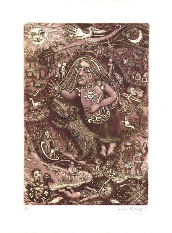
This is the weird and wonderful world that I encounter on my neighbourhood walks. Here are the birds and dogs and people I meet atop South Port cliffs and Trigs Point, at the Onkaparinga river mouth, along the sand and samphire. Here is Sauerbier House at Port Noarlunga, Jubilee Park with its giant giraffe, and Gary the Goat amongst a mob of ‘roos in a paddock that awaits subdivision.
Double drop copper etching on Somerset paper
$330 (5 A/Ps for sale)
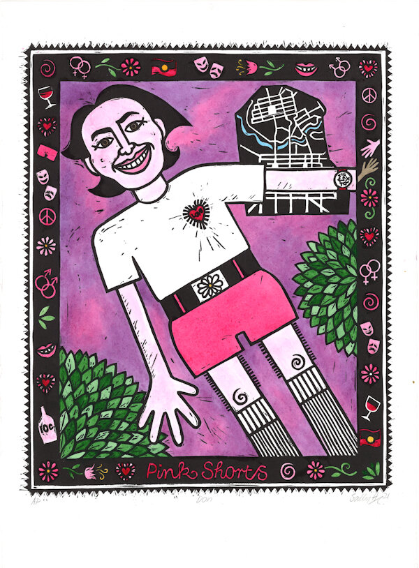
Don Dunstan’s socially progressive leadership of SA during the 60s and 70s oversaw (amongst other things) the recognition of Aboriginal land rights, the decriminalisation of homosexuality, abolishment of the death penalty, relaxation of censorship and drinking laws along with being a great supporter of the arts. He famously turned up to Parliament one hot November day wearing a white T-shirt, and very short pink shorts. This hand-coloured linoprint is based on an iconic newspaper photograph taken that day, as well as Barbara Hanrahan’s screenprint Flying Mother.
Hand-coloured lino print on Stonehenge Aqua watercolour paper
$280 (6 A/Ps for sale)

Tracy Crisp... When I read Barbara Hanrahan's 'Weird Adelaide' (which led me to The Scent of Eucalyptus which led me to everything else) it had an enormous impact on my conception of myself as a writer. I understood myself as an Adelaide writer. Someone whose writing was grounded in her relationship with this city.
I write in many different formats, but what I love the most is to write small pieces that can be read on their own, but understood as fragments of larger stories. It's the style I was able to experiment with most freely in my blogging days in the early 2000's. Caren was one of my first blogging friends. I was fascinated by her world of letterpress and printmaking and inspired by her commitment to experimenting, to collaborating and to sharing her skills and knowledge. When I was looking for a way to share my love of Barbara Hanrahan's writing but didn't know where to start, turning to Caren was the natural solution.
Caren Florance... Barbara Hanrahan’s imagery is very distinctive, and part of this is because she lets her ideas work together with the visual language of whichever print medium she uses: she makes the most of the scratch of an etching tool, or the difference between the short, careful cuts into a woodblock and the bold buttery cutting of a warm lino plate. Her later linocuts are some of my favourite prints, so I turned to them when asked to design Tracy’s words into pages for the folio. I picked out some of her classic motifs as embellishments, and chose a title typeface that looked hand-drawn, or even hand-cut (Chelsea Market Pro). The idea was to look bold, legible and quirky without being cute, which is, I think, a word I would never apply to Hanrahan’s individual vision of the world. She was individual, determined, slantwise, and irreplaceable. Just like Tracy.
Photopolymer letterpress print on Somerset bookwove paper
Written by Tracy Crisp
Letterpress design by Caren Florance
Printed at Stone & Quoin studio by Tracy Crisp with Damien Warman & Simone Tippett
$250 ea
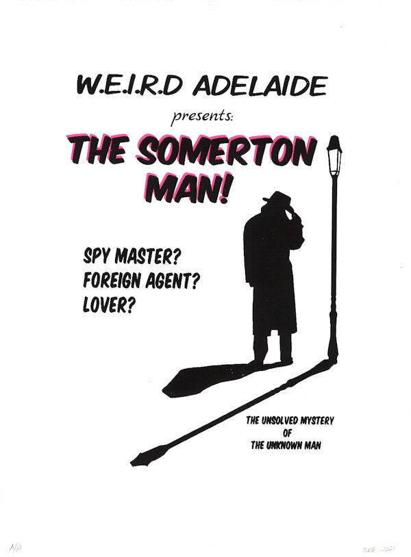
In 1948 the body of a man was found at Somerton beach - he carried no identification - even the labels from his clothing had been removed. All the police had to go on was a torn page from a book and some odd scribblings believed to be a code.
A huge police investigation ensued, cryptographers and other experts were called in but to no avail.
There was much speculation in the press about the man’s identity and in the atmosphere of the Cold War, rumours of intrigue and espionage were rife.
The case has never been solved and The Somerton Man has never been identified. His remains lie In the West Terrace Cemetery beneath a headstone that reads:
Here Lies The Unknown Man
Who Was Found
At Somerton Beach
1st Dec 1948
Only last week The Advertiser ran a double page spread stating the case of the Somerton Man had been reopened; the police are planning to exhume him for DNA testing to finally discover who he really was.
2 layer screenprint
$200 (2 A/Ps for sale)

Inspired by Barbara Hanrahan’s print Dear Miss Ethel Barringer, Life Catcher uses Hanrahan’s style of drawing and investigation of the balancing act between living an artist life and family life. My Land Rover – the solid, no frills vehicle that could take you everywhere and anywhere you want, balances precariously stuck on its pole whilst all manner of things are happening around it and the life catcher.
This print references the Land Rover monument at Keith, SA, affectionately known the Land Rover on a Pole.
Copper plate etching
$300 (4 A/Ps for sale)
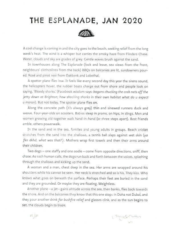
Tracy Crisp... When I read Barbara Hanrahan's 'Weird Adelaide' (which led me to The Scent of Eucalyptus which led me to everything else) it had an enormous impact on my conception of myself as a writer. I understood myself as an Adelaide writer. Someone whose writing was grounded in her relationship with this city.
I write in many different formats, but what I love the most is to write small pieces that can be read on their own, but understood as fragments of larger stories. It's the style I was able to experiment with most freely in my blogging days in the early 2000's. Caren was one of my first blogging friends. I was fascinated by her world of letterpress and printmaking and inspired by her commitment to experimenting, to collaborating and to sharing her skills and knowledge. When I was looking for a way to share my love of Barbara Hanrahan's writing but didn't know where to start, turning to Caren was the natural solution.
Caren Florance... Barbara Hanrahan’s imagery is very distinctive, and part of this is because she lets her ideas work together with the visual language of whichever print medium she uses: she makes the most of the scratch of an etching tool, or the difference between the short, careful cuts into a woodblock and the bold buttery cutting of a warm lino plate. Her later linocuts are some of my favourite prints, so I turned to them when asked to design Tracy’s words into pages for the folio. I picked out some of her classic motifs as embellishments, and chose a title typeface that looked hand-drawn, or even hand-cut (Chelsea Market Pro). The idea was to look bold, legible and quirky without being cute, which is, I think, a word I would never apply to Hanrahan’s individual vision of the world. She was individual, determined, slantwise, and irreplaceable. Just like Tracy.
Photopolymer letterpress print on Somerset bookwove paper
Written by Tracy Crisp
Letterpress design by Caren Florance
Printed at Stone & Quoin studio by Tracy Crisp with Damien Warman & Simone Tippett
$250 ea
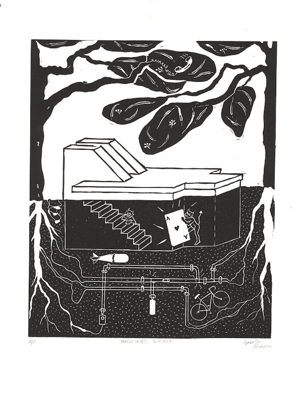
This print has been inspired by both the work of Barbara Hanrahan and the Thebarton air-raid shelter, now home to the Australian Society of Magicians (Adelaide branch). For me this site is not only one of Adelaide’s weird corners, but offers in its architecture an illustration of duality, recalling the light and dark Hanrahan brings together so naturally in her novels.
Lino print
$150 (2 A/Ps for sale)
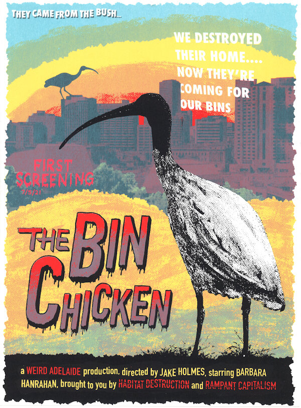
The Australian White Ibis is these days maligned as the bin chicken. Once at home in the wetlands of the Australian bush they now dig through our trash in capitals cities around Australia. Many seem to view the bird with disdain, but bin chickens are survivors. And if you think they’re a nuisance in our cities, well, we did that to ourselves.
5 layer screenprint
$200 (5 A/Ps for sale)

Tracy Crisp... When I read Barbara Hanrahan's 'Weird Adelaide' (which led me to The Scent of Eucalyptus which led me to everything else) it had an enormous impact on my conception of myself as a writer. I understood myself as an Adelaide writer. Someone whose writing was grounded in her relationship with this city.
I write in many different formats, but what I love the most is to write small pieces that can be read on their own, but understood as fragments of larger stories. It's the style I was able to experiment with most freely in my blogging days in the early 2000's. Caren was one of my first blogging friends. I was fascinated by her world of letterpress and printmaking and inspired by her commitment to experimenting, to collaborating and to sharing her skills and knowledge. When I was looking for a way to share my love of Barbara Hanrahan's writing but didn't know where to start, turning to Caren was the natural solution.
Caren Florance... Barbara Hanrahan’s imagery is very distinctive, and part of this is because she lets her ideas work together with the visual language of whichever print medium she uses: she makes the most of the scratch of an etching tool, or the difference between the short, careful cuts into a woodblock and the bold buttery cutting of a warm lino plate. Her later linocuts are some of my favourite prints, so I turned to them when asked to design Tracy’s words into pages for the folio. I picked out some of her classic motifs as embellishments, and chose a title typeface that looked hand-drawn, or even hand-cut (Chelsea Market Pro). The idea was to look bold, legible and quirky without being cute, which is, I think, a word I would never apply to Hanrahan’s individual vision of the world. She was individual, determined, slantwise, and irreplaceable. Just like Tracy.
Photopolymer letterpress print on Somerset bookwove paper
Written by Tracy Crisp
Letterpress design by Caren Florance
Printed at Stone & Quoin studio by Tracy Crisp with Damien Warman & Simone Tippett
$250 ea
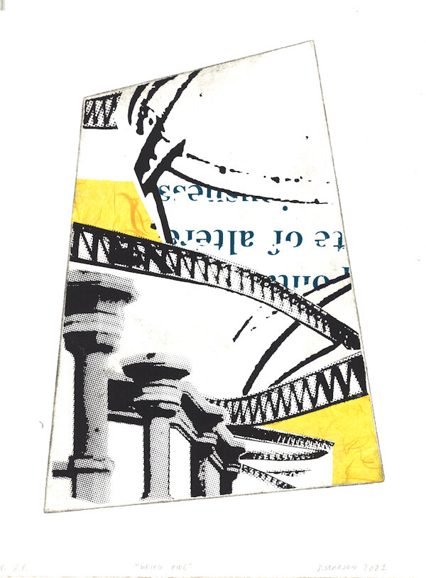
Growing up in the early 90's, the city centre of Adelaide was always an intriguing place. The Dazzleland roller-coaster, which loomed high above the Myer Centre, seemed the epitome of what the city was to a young outsider; intriguing, terrifying, and somewhat ostentatious. However, for the last 2 decades, a trip to the upper levels of the shopping centre could only be described as 'weirdly quiet'; In 1998, only 7 years after its launch, Dazzleland closed down, with equipment such as the rollercoaster auctioned off to an interstate developer.
Intaglio ink, chine colle and screenprint
$250 (1 A/P for sale)
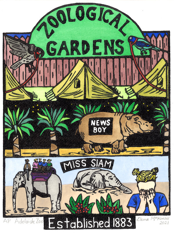
My hand-coloured linoprint depicts three historical events at the Adelaide Zoo.
During the Great Depression in the 1930s, poor people camped in tents along the Torrens River including directly outside the Adelaide Zoo. Some people broke into the Zoo and stole birds to cook as they were so hungry.
The second hippopotamus bought for the Adelaide Zoo was called ‘Newsboy’. The zookeepers pasted the headline news of the day on his sides for visitors to read!
The first elephant at the Adelaide Zoo was ‘Miss Siam’, born in Thailand in 1881 and arrived in Adelaide in 1883. She was a favourite with visitors and gave thousands of children rides. When she died in 1904, a local newspaper published a very graphic poster of the death of Miss Siam with children crying.
Hand-coloured lino print
$300 (6 A/Ps for sale)
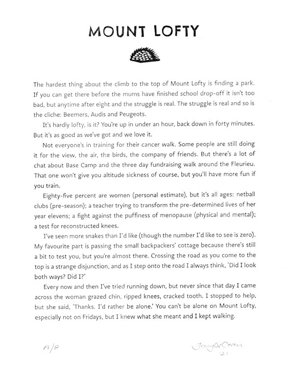
Tracy Crisp... When I read Barbara Hanrahan's 'Weird Adelaide' (which led me to The Scent of Eucalyptus which led me to everything else) it had an enormous impact on my conception of myself as a writer. I understood myself as an Adelaide writer. Someone whose writing was grounded in her relationship with this city.
I write in many different formats, but what I love the most is to write small pieces that can be read on their own, but understood as fragments of larger stories. It's the style I was able to experiment with most freely in my blogging days in the early 2000's. Caren was one of my first blogging friends. I was fascinated by her world of letterpress and printmaking and inspired by her commitment to experimenting, to collaborating and to sharing her skills and knowledge. When I was looking for a way to share my love of Barbara Hanrahan's writing but didn't know where to start, turning to Caren was the natural solution.
Caren Florance... Barbara Hanrahan’s imagery is very distinctive, and part of this is because she lets her ideas work together with the visual language of whichever print medium she uses: she makes the most of the scratch of an etching tool, or the difference between the short, careful cuts into a woodblock and the bold buttery cutting of a warm lino plate. Her later linocuts are some of my favourite prints, so I turned to them when asked to design Tracy’s words into pages for the folio. I picked out some of her classic motifs as embellishments, and chose a title typeface that looked hand-drawn, or even hand-cut (Chelsea Market Pro). The idea was to look bold, legible and quirky without being cute, which is, I think, a word I would never apply to Hanrahan’s individual vision of the world. She was individual, determined, slantwise, and irreplaceable. Just like Tracy.
Photopolymer letterpress print on Somerset bookwove paper
Written by Tracy Crisp
Letterpress design by Caren Florance
Printed at Stone & Quoin studio by Tracy Crisp with Damien Warman & Simone Tippett
$250 ea
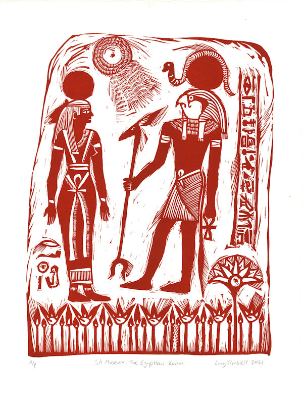
SA Museum: The Egyptian Room is inspired by the beautifully old-fashioned room of Egyptian artefacts in the South Australian Museum. Established in 1939, it has hardly changed since and still contains the original murals and decorated signs of a bygone era. My favourite place in the Museum as a child, I have many memories of being equally fascinated and enthralled by the Egyptian Room.
Lino print on Hahnemule paper
$200 (6 A/Ps for sale)
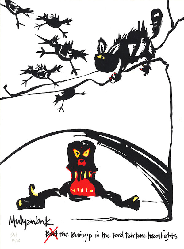
When I was really little, I was wonderfully terrified by the scary roaring bunyip at Murray Bridge. My parents would stop nearby to "stretch their legs" on the long drive to Adelaide in the 1970s. In the headlights of Dad’s new Ford Fairmont, the bunyip was so real to my small self, but I knew I was safe because it was trapped in a weldmesh cage and couldn’t get me. Also, it stopped roaring when the money ran out, so clearly all I had to do to survive, was outlast the 20c piece. Years later my friend Sally Heinrich said she saw Don Dunstan officially open Bert the Bunyip, wearing a pink safari suit. Now I know Bert wasn’t really called Bert, nor Bertha, and Baby Bunyip was probably a practical joke. His real name is The Mulyawonk and he is genuinely terrifying. He eats anyone who swims alone or takes more fish than they can eat from the river or lake. There are photos of Mulyawonk after an oil leak... where he literally became the monster from the black lagoon.
I can’t help wondering what would happen if The Mulyawonk met any feral cats near the river… Maybe this is why Barbara Hanrahan’s cats are so wonderfully freaky… Ancestral cat memories of The Mulyawonk.
And from Sally Heinrich: One day when I was very young, my parents and I were passing through Murray Bridge, where my Dad grew up. There was a huge crowd in the park near the river, and on investigation we discovered they were crowded around a raised stage, gazing adoringly up at the Premier, Don Dunstan. Ceremonially he cut a ribbon, placed a 20c coin in the slot of a small metal box and, for the first time, Bert the Bunyip emerged roaring from the water. I remember Don was resplendent in a short-sleeved and short-legged safari suit and I’m quite sure that it was pink. Like the very short pink shorts he turned up to Parliament in, one hot November day.
Multi-layer screenprint with hand-colouring on Hahnemule paper
$200 (1 A/P for sale)
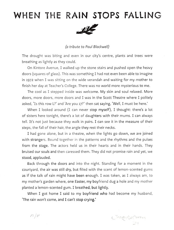
Tracy Crisp... When I read Barbara Hanrahan's 'Weird Adelaide' (which led me to The Scent of Eucalyptus which led me to everything else) it had an enormous impact on my conception of myself as a writer. I understood myself as an Adelaide writer. Someone whose writing was grounded in her relationship with this city.
I write in many different formats, but what I love the most is to write small pieces that can be read on their own, but understood as fragments of larger stories. It's the style I was able to experiment with most freely in my blogging days in the early 2000's. Caren was one of my first blogging friends. I was fascinated by her world of letterpress and printmaking and inspired by her commitment to experimenting, to collaborating and to sharing her skills and knowledge. When I was looking for a way to share my love of Barbara Hanrahan's writing but didn't know where to start, turning to Caren was the natural solution.
Caren Florance... Barbara Hanrahan’s imagery is very distinctive, and part of this is because she lets her ideas work together with the visual language of whichever print medium she uses: she makes the most of the scratch of an etching tool, or the difference between the short, careful cuts into a woodblock and the bold buttery cutting of a warm lino plate. Her later linocuts are some of my favourite prints, so I turned to them when asked to design Tracy’s words into pages for the folio. I picked out some of her classic motifs as embellishments, and chose a title typeface that looked hand-drawn, or even hand-cut (Chelsea Market Pro). The idea was to look bold, legible and quirky without being cute, which is, I think, a word I would never apply to Hanrahan’s individual vision of the world. She was individual, determined, slantwise, and irreplaceable. Just like Tracy.
Photopolymer letterpress print on Somerset bookwove paper
Written by Tracy Crisp
Letterpress design by Caren Florance
Printed at Stone & Quoin studio by Tracy Crisp with Damien Warman & Simone Tippett
$250 ea


Curated by Tracy Crisp and Simone Tippett, with help from Caren Florance (Canberra letterpress legend) and Vicki Reynolds (Adelaide printmaking quiet achiever).
Click here for Mei Sheong Wong’s review of the Mrs Harris exhibition.
Click here for Julia Wakefield’s lovely article about the Mrs Harris exhibition in Weekend Notes.
Click here for Barbara Hanrahan’s 1988 article in the Adelaide Review.
Click here for Tracy Crisp’s 23 June 2020 article in the Adelaide Review.
Click here for the Background information on each of the prints in the exhibition.
Click here for the List of Works in the Mrs Harris exhibition.
Click here for the Artist Bios of everyone in the exhibition.
Click here for the Mrs Harris exhibition invitation.
Click here for list of print definitions, in case you are wondering what everything is!
For more information, please email Tracy Crisp or Simone Tippett.

